There are different ways to represent a candlestick. The most common is the green/red bar. Let's talk about it.
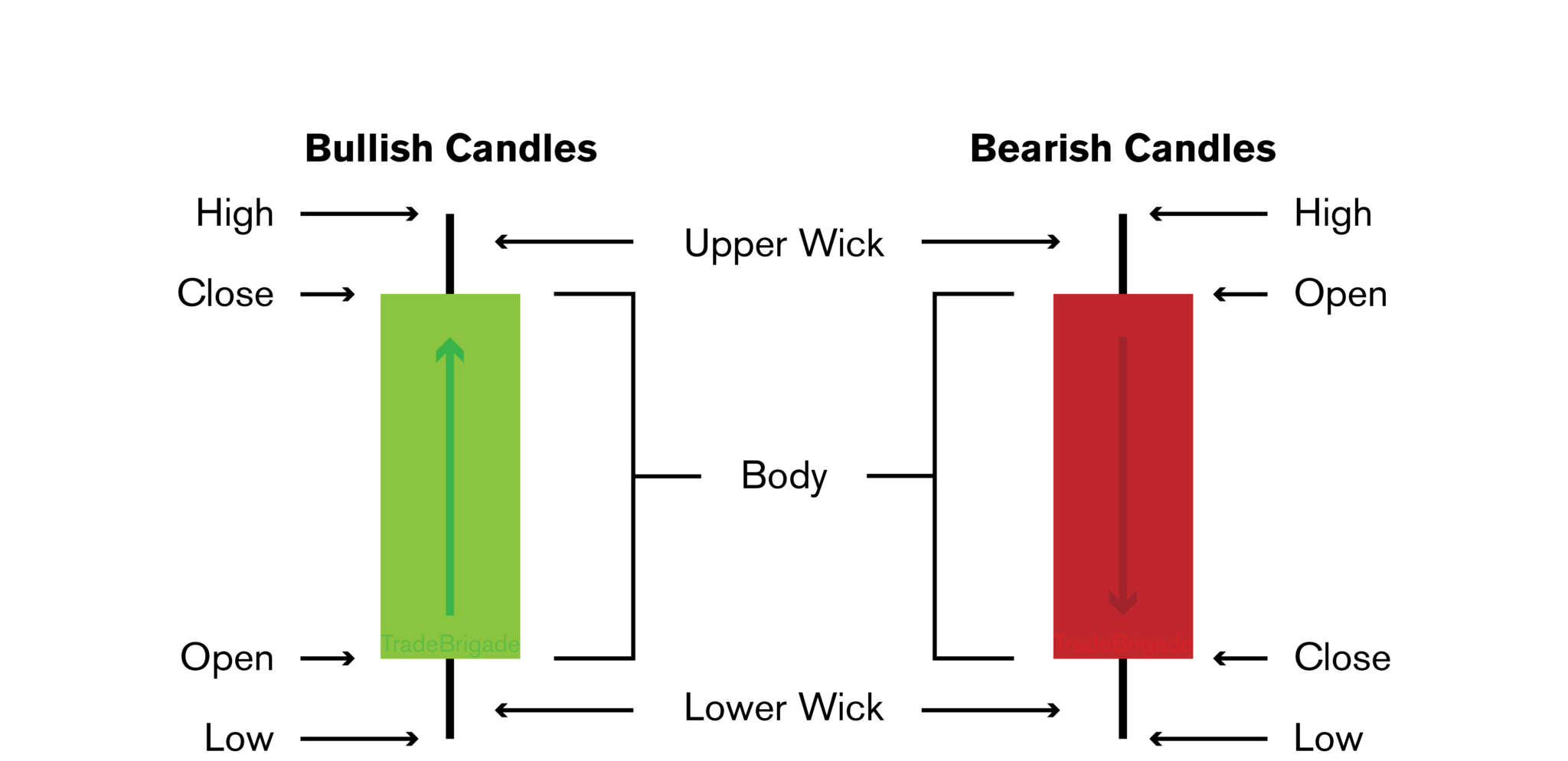
A candlestick bar has the following elements:
- Opening point: the price at the start of a given period.
- Highest point: the highest price of a given period.
- Lowest point: the lowest price of a given period.
- Closing point: the price at the end of a given period.
- Bar colour: green or red. The bar is green when the price is rising (the opening price is lower than the closing one). The bar is red when the price is dropping (the opening price is higher than the closing one).
- Body: the difference between the opening and closing points.
- Wick or Shadow: the upper wick or shadow is the difference between the highest point and the highest point of the body; the lower wick or shadow is the difference between the lowest point and the lowest point of the body.
It is very common for a candlestick's open, high, low and close values to differ.
From a Curve to a Candlestick
We can see a candlestick as a summary of continuous (or discrete) points in a given period of time.
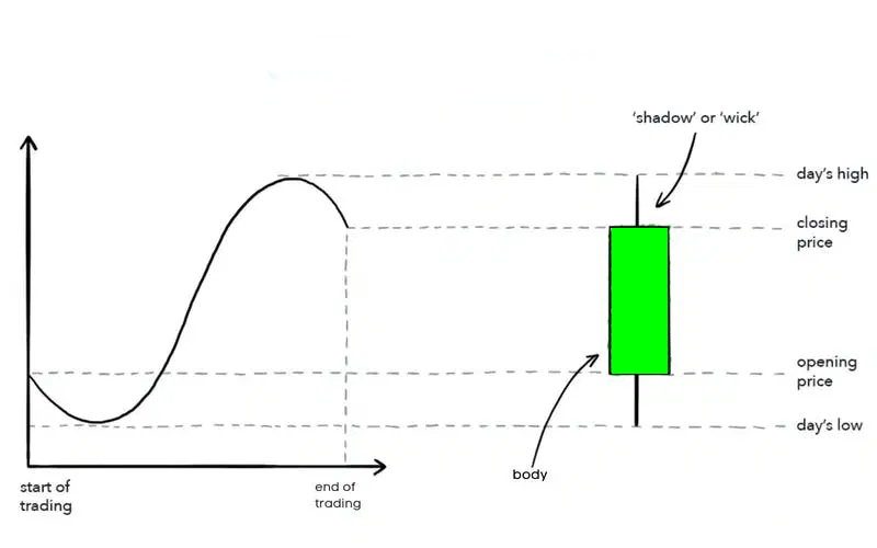
There are some advantages and disadvantages of using candlesticks instead of a continuous or discrete curve. Let's start with the good news:
- A candlestick chart provides a big-picture overview of what is happening.
- Large graphs can be translated into smaller ones depending on the period of time a candlestick represents.
On the bad news side:
- A candlestick bar doesn't show what happens within a time period. You can't know if there was a small slope within. A candlestick bar only shows four values.